ShedShare
Community-based tool sharing platform
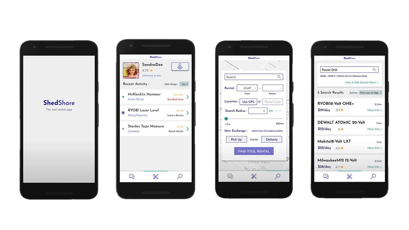
High Fidelity Screens
Background
Objective: Inspired by the Toronto Tool Library, the goal for this project was to create a digital platform for people to borrow tools within their community.
My Role: UX/UI/Everything in between – independent student project
Tools: Figma, Photoshop, Google Docs & Sheets & useberry.com
Defining the Problem
Client Needs
As a school project, the client in this case is hypothetical. We can consider the client to be a start-up that is building a digital platform to facilitate peer-to-peer tool rentals.
User Pain Points
Renter: Desire to do household projects but may lack the storage or money to invest in costly tools required.
Lender: Have invested in tools that are only used occasionally. The app would give them an opportunity for ROI on the tools in their shed.
Both: Risk of injury or property damage. Accidents can occur when using tools of this nature. It is important that the renter understands that their safety and the condition of the lent item is their responsibility.
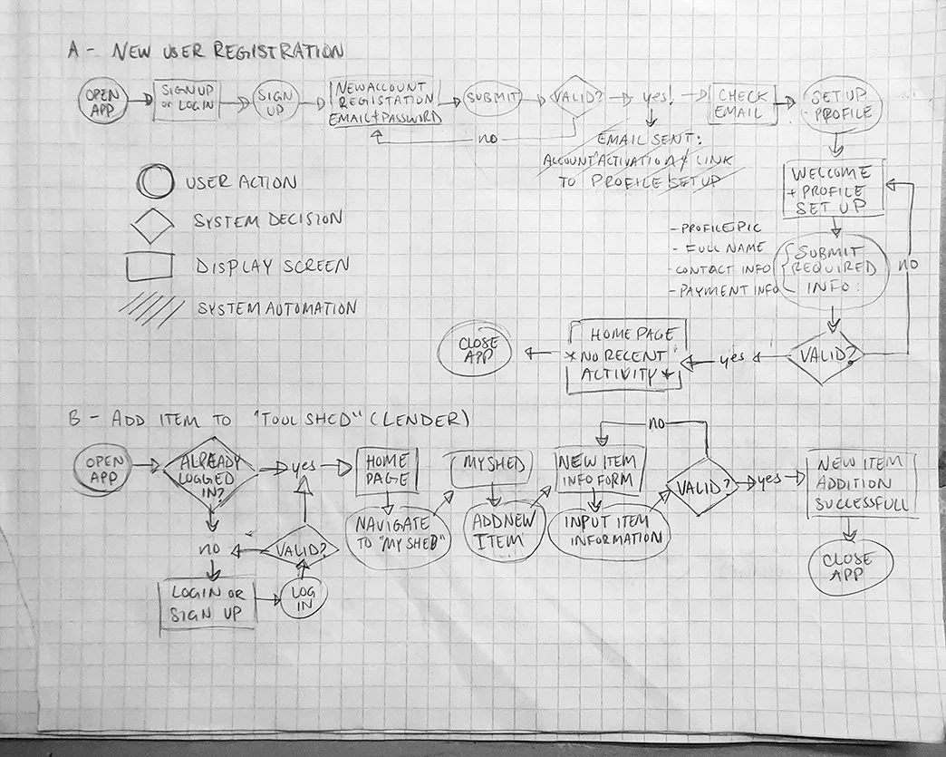
Early Ideation
User Flows & Low Fidelity Sketches
These flows plan the paths that users will take to perform specific actions, focusing on the behind-the-scene mechanics of the digital platform.
I drew rough sketches to hash out the fundamental elements of some of the screens that will make up the digital platform.


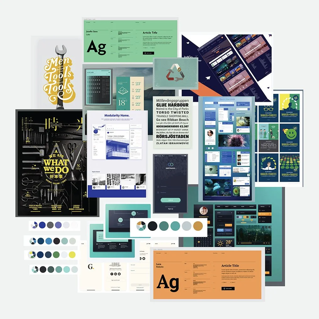
Mood Board
A collection of visual inspiration to inform the look & feel of the app going forward.
Medium Fidelity Screens
Using Figma for the first time, I designed the screens below based on the user flows and low fidelity sketches.
At this point, the app is beginning to take shape and is ready for peer review and user feedback.
The screens below demonstrate some of the core interactions users will be able to preform using the app.


Understanding Users
Objective of Study
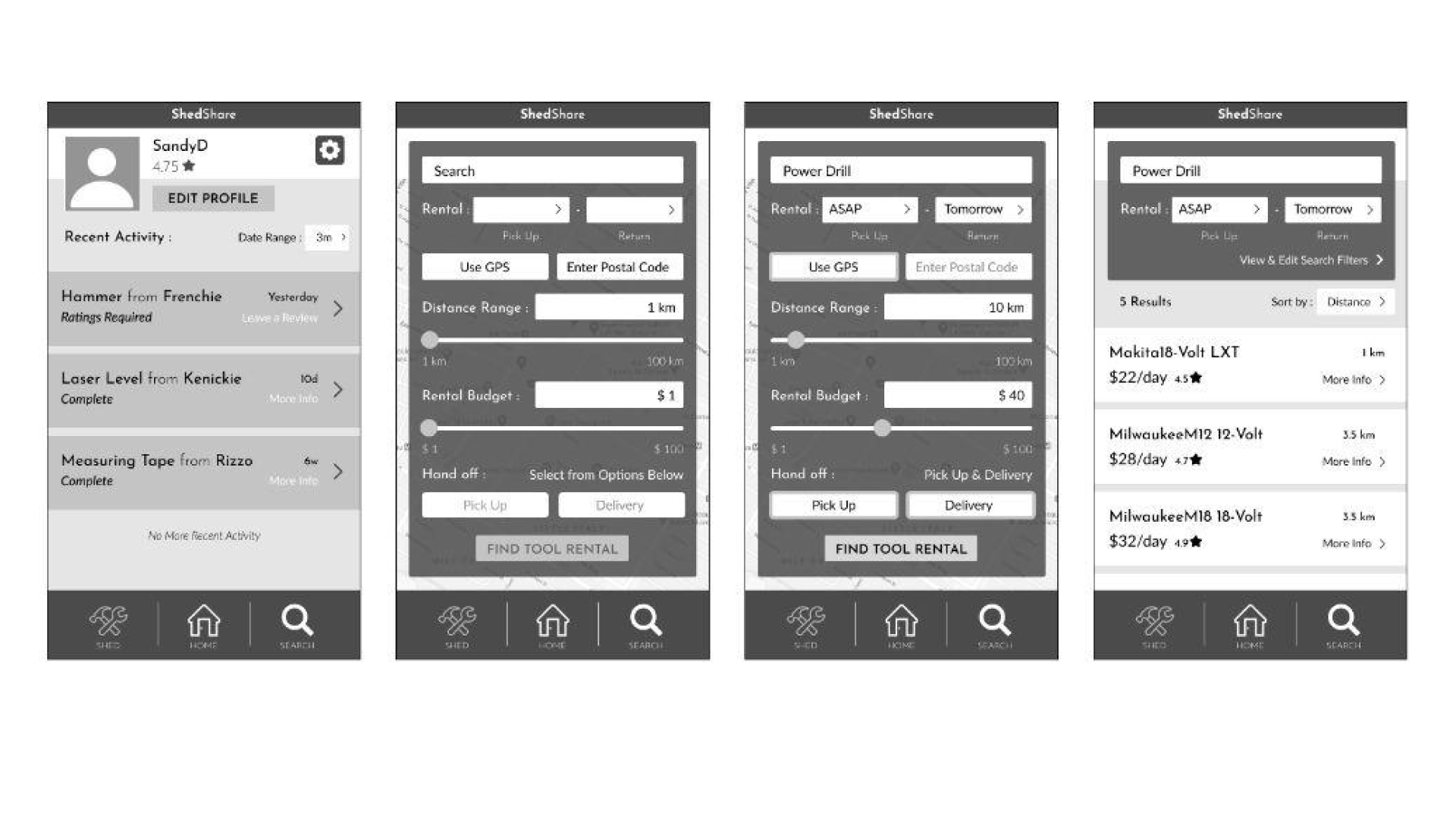
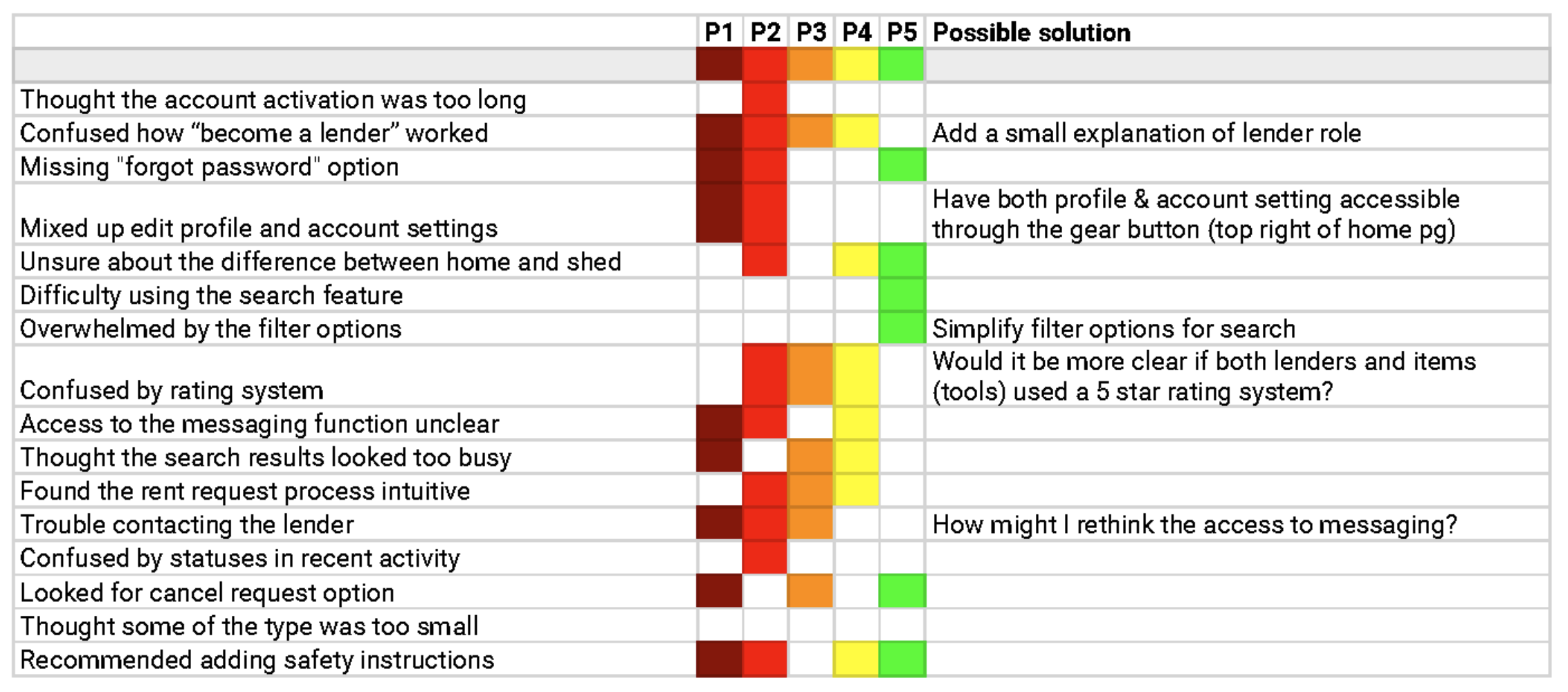
This study was performed to test the effectiveness of the first iteration of ShedShare’s Mid-Fidelity wireframes (pictured in the previous section).
The goal of this study in particular was to evaluate its clarity and functionality of its basic features through user testing. I wanted to discover how easy the application is to navigate at this stage and whether users find it practical and desirable.
Research Questions:
What do potential users expect from a community based tool rental app?
Does the app seem enticing to potential users?
Does the account activation process align with users’ expectations?
Does the recent activities page clearly demonstrate its functionality?
Is the lender/renter relationship clearly communicated?
Does the search function and results screen satisfy the user's needs?
Do users’ understand the review and rating systems?
Are the account settings easily accessible/editable?
Methodology
User testing was performed remotely with 5 participants, one-on-one using Zoom. Participants were provided with mid-fidelity wireframes, PDF versions via email.
The participants shared their screen with the moderator (myself) and were asked to voice their thoughts aloud while performing a series of tasks.
MidFi Screen with Ideal Path of Interaction:


Rainbow Chart
Test Results Based on User Study
Study Summary
While users complimented the app's purpose and design aesthetic, they found several areas for improvement.
Multiple users’ noted the absence of a "forgot password" option and found the access to the messaging function confusing.
Participants also recommended adding safety instructions to tool descriptions and simplifying the filter options within the search function.
To address confusion, the app could provide more clarification about the roles & responsibilities of the two types of users; lenders and renters.
Finally, the participants suggested that a cancel rental request option be added to provide a fix for those who might have accidentally sent a request or changed their mind.
Design Iteration
High Fidelity Screens


Based on both user and peer feedback, I created iterations of the app’s interface.
Experimenting with colour, type and layout, the app’s look and feel started to come to fruition.
Eventually choosing a primarily white and blue colour scheme with a few accent colours to denote different states and situations. With so much information on some screens, I found that it was advantageous to use a minimalistic colour palette.
I also created a new set of icons and reduced their size for the app’s bottom bar navigation to optimize the screen’s real-estate.
Usability Testing
Once the high fidelity screens were created, I built a few interactive prototypes using figma to further assess the usability of the evolving platform.
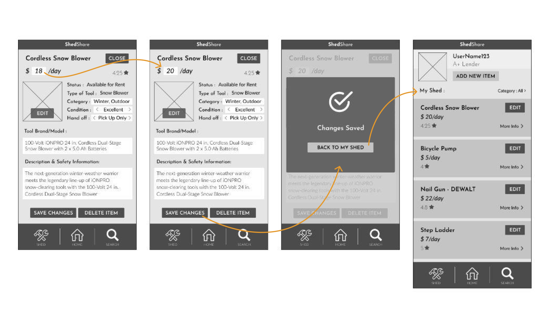
Creating a Profile


The account activation task had a good success rate and took an average of about 30 seconds for participants to complete.
The heat maps from this session show that the participants found the onboarding process easy to navigate. The vast majority of clicks occurred on interactive elements that would trigger the next step in the prototype.
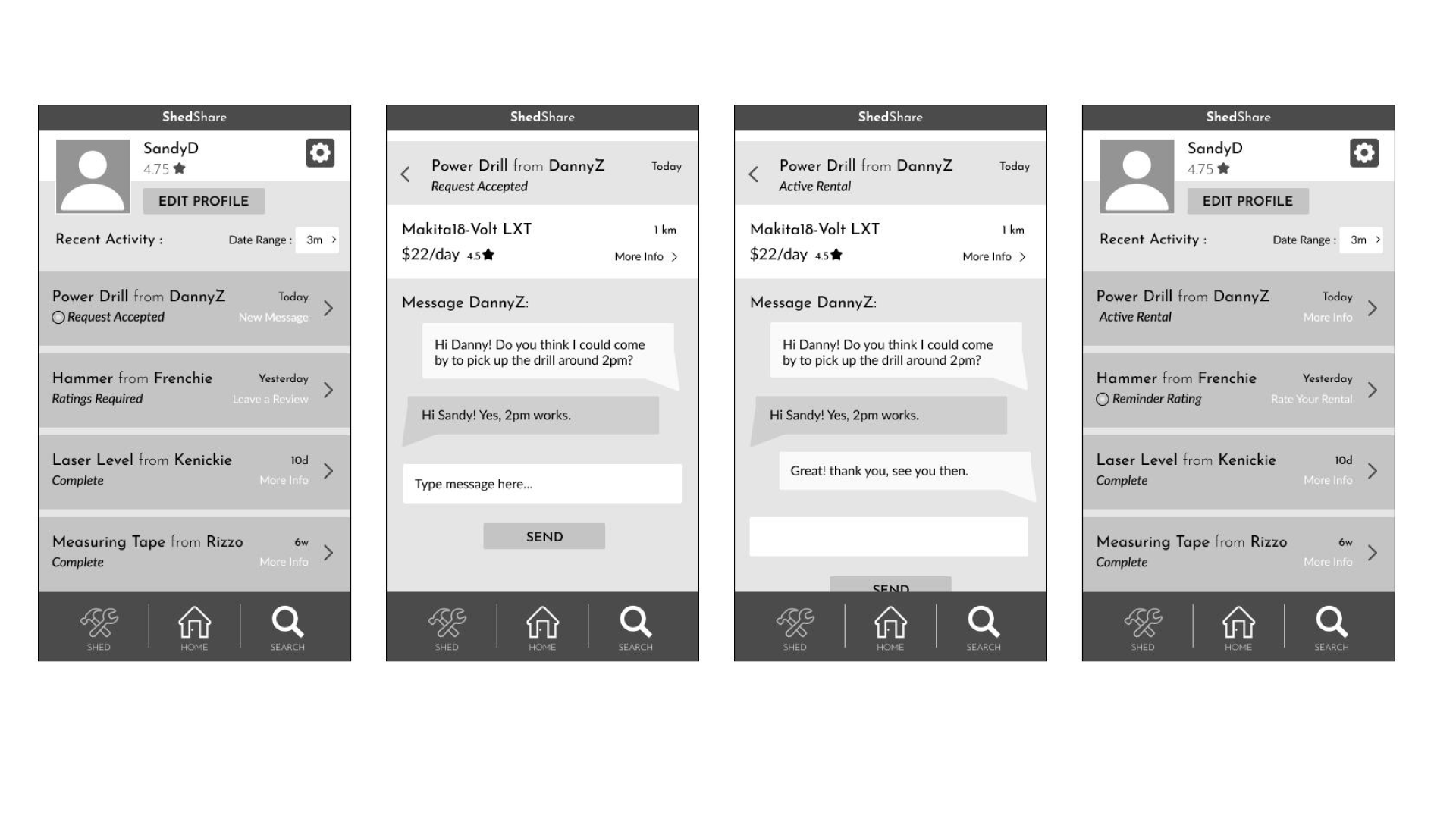
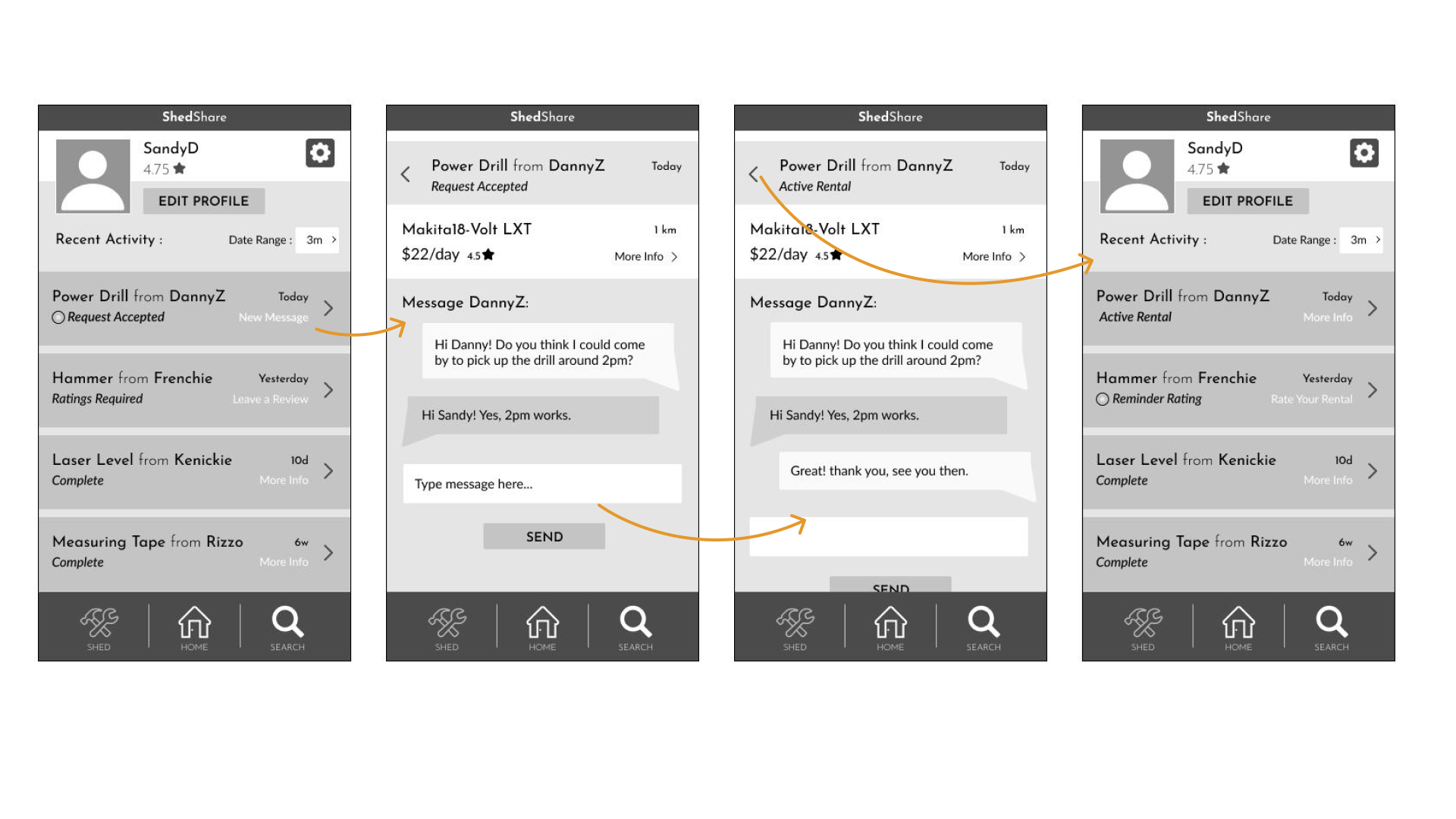
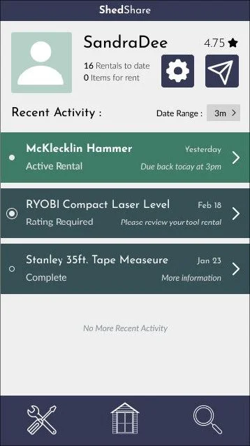
User Messaging


The direct messaging usability testing scenario had an 100% success rate and took participants roughly half a minute to complete.
However, after analysing the heat maps of the Recent Activity screen, it seems that there are some non-interactive elements, such as the status of each item listen in recent interactions, that participants attempted to click on.
Future iterations of the app should work to clearly distinguish this difference.
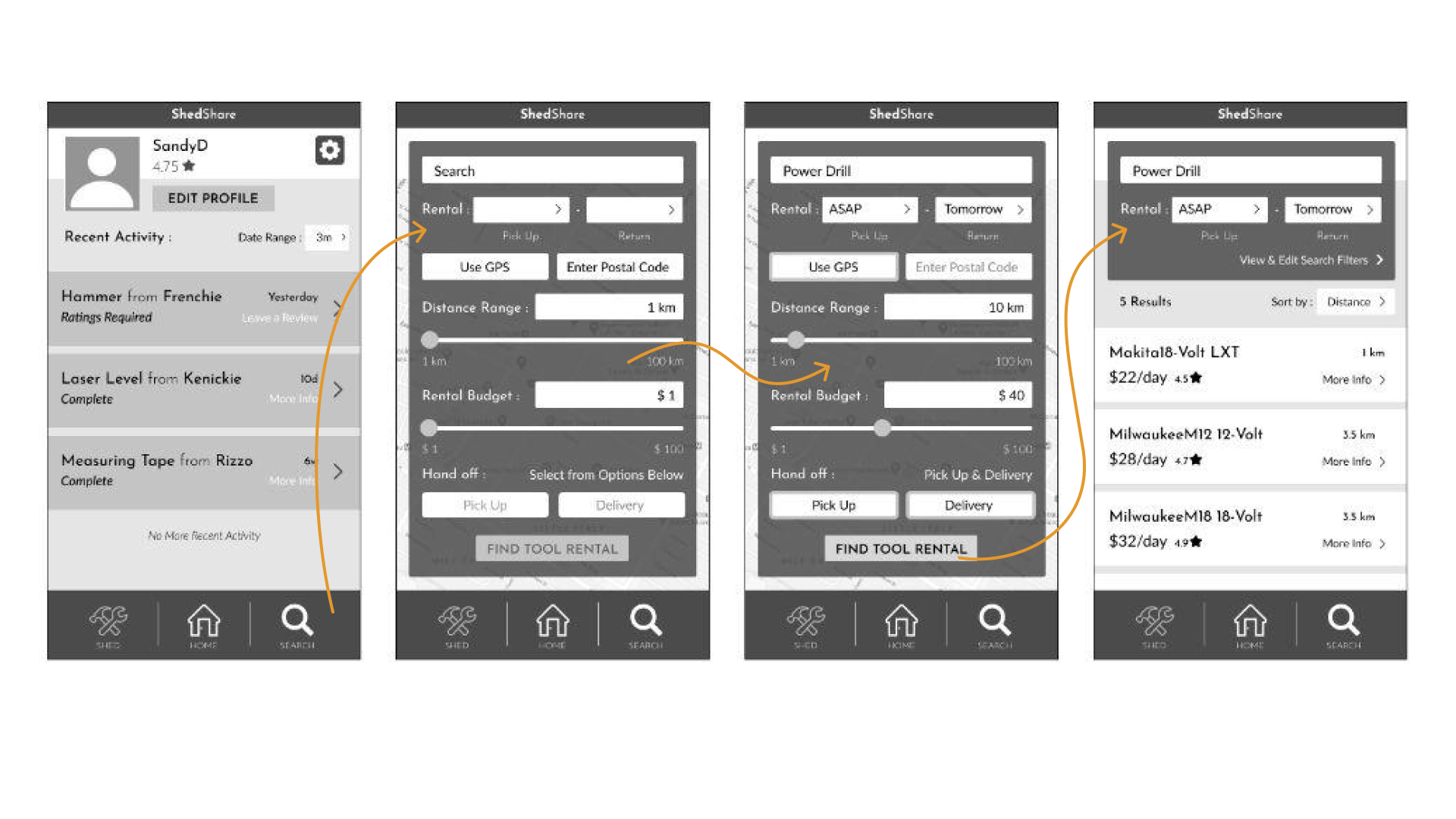
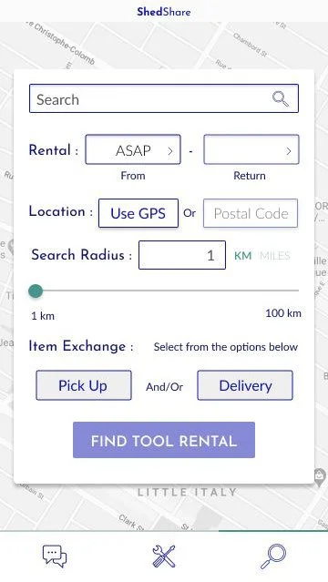
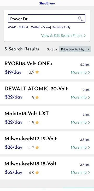
Search Function


The third and final task, the search for a tool rental task, also had a 100% success rate amongst participants. Unlike the other two test sessions in this series of user-testing, the time each participant took to complete the task was quite varied.
This user testing session also revealed that the position of the pick up and delivery buttons are currently counterintuitive and should be corrected in future iterations of this project.
Style Guide
Design Elements


These are some of the visual elements that compose ShedShare’s interface.
The logo, typography, colour palette, icons, buttons and other components were collected into a design style guide to keep everything organized.
High Fidelity Prototypes
Watch the two videos below to see the final prototypes for this project.
Reflection
Learning Outcomes:
Throughout the course I have gained a better understanding of the development of digital products. Going from an idea, to sketches on a page, to the screen and finally to a functional and shareable prototype.
Another huge take-away, for me, was the importance of building a solid design style system. It took a lot of youtube tutorials to even begin to understand the significance of building responsive components, publishing those into libraries and being able to use them throughout the design process.
A big assumption I made initially was that this app idea would be relatively straightforward to build. This turned out to be false at every step. Since my topic deals with sharing real materials (tools) which incorporate two different user-roles (owners and renters) as well as the exchange of funds and ratings, plus safety concerns...etc. My “simple idea” turned out to be anything but simple.
Lastly, peer and user feedback is invaluable. As designers we are often too close to the project to be able to see the problems at hand, let alone fix them.